PROVON® Brand Logo Standards
The following standards are used to ensure that the colors used with the PROVON® brand logo are consistent.
Only use authentic PROVON® brand logos
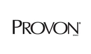
Always use the one-color version of the PROVON® brand logo, shown here, when possible. Alternates are available to accommodate production constraints. Only use the logos provided from this site. Never create an alternate version of the PROVON® brand logo.
Allow appropriate clear space around the logo
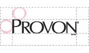
This standard is to ensure that the logo is not crowded; that is, the logo must be presented for maximum impact. Clear space enhances impact because it prevents the PROVON® brand logo from being crowded and obscured by typography and other graphic elements.
Preferred distance of clear space between logo and other elements is equivalent to the height of the "O" in the design mark.
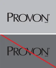
Assure adequate contrast
When placing the logo on top of a background image, be sure the area behind the logo provides adequate contrast. Overly busy, non-contrasting or dark color backgrounds reduce the visual presence of the logo. Use the reversed out version of the PROVON® brand logo in instances where there isn't adequate contrast.
Never alter the typeface in any way
The PROVON® brand logo uses a custom-designed font used exclusively for the PROVON® brand logo. Never change the font, change the size of the logotype or attempt to recreate the logo using a closely matched font.
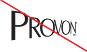
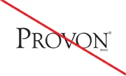
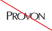
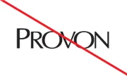
Never distort or angle the logo
Never distort the logo at rest in any way. If using the PROVON® brand logo in animated graphics, always make sure the logo at rest is in its correct form.
Never delete logo elements or use as standalone graphics
Never delete elements or use any of the elements of the PROVON® brand logo as a standalone or accent graphic. The registration mark and the word “BRAND” are integral parts of the logo.

Never change the size or proportion of logo elements
Always use the logo exactly as it is provided. Never change the proportion of any of the elements.
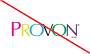
Never reproduce in unapproved colors
Always produce the PROVON® brand logo in approved colors, per the brand standards.
Never omit the ® or the word BRAND
In order to protect our logo, we are legally required to always include the word BRAND and the ® with the PROVON® brand logo. The PROVON® brand logo works as a unit. All elements must be in place at all times.
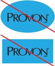
Never enclose the logo in a shape
Enclosing the logo in a shape diminishes equity and creates confusion as to whether the shape is part of our equity.
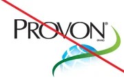
Never use the logo as part of another logo
Brand equity is diminished when the PROVON® brand product logo is incorporated into other logos or logo-like graphics.
Never add a drop shadow or other graphic element
Always use the logo exactly as it is provided. Never add a drop shadow, outline or any other graphic element to the PROVON® brand logo.
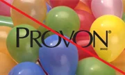
Never place over a cluttered or high contrast background
Never place the PROVON® brand logo over a cluttered or high contrast background. If placing the logo within a photo, choose an area with even tone. If placing the logo on a dark colored background, use the reversed out version of the logo.
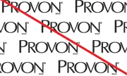
Never use the logo as wallpaper
Repeated use of the logo in a pattern diminishes its impact. Never create a pattern with the PROVON® brand product logo.
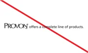
Never use in a sentence
The logo must never be used in a sentence. Always use the word "PROVON" in text. Always use all capital letters for the word "PROVON" when it appears in text. Always use the same font as corresponding text if using the word "PROVON" in a headline or sentence.